Data Visualisation
NVable still get a kick out of wrangling some sense from data. Some people may think that is a more than a little masochistic, particularly given the data we have dealt with over the years. But it is suprisingly rewarding to simplify complex data into meaningful information.
A dashboard is a visual display of the most important information needed to achieve one or more objectives that has been consolidated on a single computer screen so it can be monitored at a glance. Stephen Few
I’ve quoted Stephen Few because he has, over the years, given people working with visualising data a great set of practical guidance and even developed the Bullet Graph. Eloquence through simplicity is one of the key messages. Take a look at Information Dashboard Design (ISBN 978-1938377006).
It’s quite difficult to avoid the pitfalls of throwing up a gauge, dial, pie chart etc when almost every example of a dashboard will show you that. Every component library a software developer picks up will also point in that direction. Taking the time to think through a way of meaningfully presenting information in a way that actually makes a difference to the user is not easy. And I certainly don’t think we always get it right – there is always room to learn.
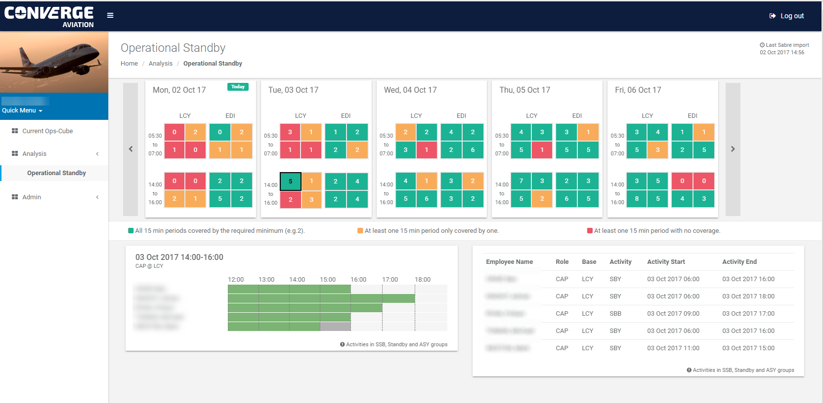
However I thought I would share a link to give you a taste of one small aspect of what we are doing at the moment: Converge: Operational Standby.